Shane AS Media Blog
Friday, 31 March 2017
Thursday, 30 March 2017
Filming Locations
My film contains a total of four locations. The primary location for my filming has been in my grandparent’s loft. The reason for selecting the loft was mainly due to the miscellanea present within the space. A great deal of inspiration I had derived from the various items in the space.
The three remaining locations have been filmed outdoors in Taiwan. The first (the jungle) was filmed in Taipei Zoo, whilst the second and third (mountains and hot spring) were filmed in the mountainous region of Yang Ming Shan. The reason I’ve chosen these locations for these shots is to include a unique setting for my film.
Filming Schedule
Date
|
Time
|
Location
|
Shots
|
20/12/16
|
12:00-2:00
|
Taipei Zoo
|
Shot of Treeline
|
23/12/16
|
12:00-3:00
|
Yang Ming Shan
|
Landscape Shot/Hot springs
|
2/18/17
|
10:30-1:00
|
Grandparent’s Loft
57 Lockier Walk, Wembley
|
All Indoor Shots, including gun, maps, photographs and miscellanea.
|
Storyboard
My First Storyboard
This is my first attempt at creating a storyboard for my film. Unfortunately, this idea never came to fruition due to casting issues, however, some elements of it were used as inspiration for my final product, including the setting (dense jungle and a view of the city). Therefore, I thought it worth mentioning, as a great deal of preparation was put into this initial idea, despite it’s failure to come about.
The entire film would’ve been shot in first person POV. The first scene (top left) shows four characters standing in front of a protagonist who appears to be tied up. One of them appears to be the leader. In the first two scenes, the protagonist is slipping in and out of consciousness therefore these scenes will be presented vaguely, as the protagonist will be blacking out and reawakening several times.
The second scene depicts the leader revealing an assortment of torture instruments on a table (axe, blade and syringe). This implies that the characters shown on screen wish to torture the protagonist. The reason for this is left ambiguous. The other characters on either side of the table whilst the figure in the centre is the main antagonist.
In scene three, upon realising the protagonist has fully awoken, the antagonist approaches the victim and examines him, discerning his state of consciousness. Meanwhile, his henchmen stand and watch.
In scene four, the protagonist finds himself following the antagonist through dense jungle. The setting is mostly dark, damp and unsettling. The antagonist’s intent is left in question, as the scene implies that the social dynamic presented in the previous scenes has shifted. The supposed antagonist is no longer at odds with the protagonist. The two characters are now alone.
In scene five, the two characters find themselves atop a hill as they emerge from the jungle. A view of a city is visible as the supposed antagonist stares out at it. The POV character observes at a distance.
The final scene shows the antagonist turning to face the viewer, before approaching. He pulls from his holster a gun and hands it to the main character, revealing that they may not have been enemies but the situation they’ve found themselves in is left in question.
My Second Storyboard
This film is based during The Cold War in Vietnam. The main character is a member of The Viet Cong, planning a series of killings of influential people. The protagonist is left off screen throughout. The reason for this is to reflect how the Viet Cong’s operatives, as well as other guerrilla fighters, would blend in amongst those around them; therefore, the main character could be male, female, old or young. Hence the title, ‘In Plain Sight’.
Note: Before the film opens, a quote from Sigmund Freud appears on screen. This quote is used because the film will take the audience on a psychological journey.
The first scene opens with two separate shots of a rifle. The camera pans across it. The use of the rifle suggests to the viewer that the main character is a marksman, moreover, the shots include a mid shot of the weapon, followed by a closeup, showing more detail and emphasis on the object’s significance.
There are three main focuses present within the second scene. The camera pans from left to right, showing the objects of interest. The first of these is a bust of Buddha, which represents the dichotomy between practicing peaceful religion whilst living a violent way of life. The second focus is the illustration of Carl Yung, which represents the film’s psychological exploration of the mind of a guerilla fighter. The final focuses are the Three Wise Monkeys, representing the proverbial saying, ‘hear no evil, see no evil, speak no evil’.
The Third scene first shows a map of Southeast Asia, followed by a shot of a jungle treeline. Both shots are representative of Vietnam, therefore, establishing the film’s setting.
The fourth scene depicts a range of photographs that are of significance. The photographs shown are intentionally unclear, suggesting that the targets are nonspecific in terms of their appearance.
The fifth scene once again establishes the setting, but the increased movement of the camera adds a sense of taking action, highlighting the character’s desire for taking an active role.
The final shot consists of a hot spring which symbolises serenity and peace in an otherwise turbulent time period.
Tuesday, 28 March 2017
Monday, 6 February 2017
My Personal Favourite Thriller films
_theatrical_poster.jpg)
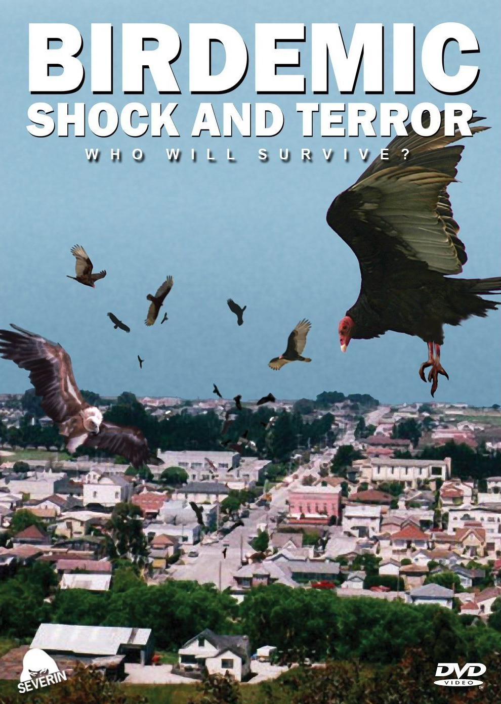
In my opinion, the films which are considered the "best of all times" are not always particularly interesting or good to me, sometimes even coming across as dated to me, as mentioned in a previous post, a good example of what I'am talking about is the 1963 film, The Birds, directed by Alfred Hitchcock. Although this is a film directed by Hitchcock, the master of suspense, the film looks incredibly outdated with poor special effects and "scares" which may have worked on audiences from the 6os but it did not work on me, my father or my younger brother. Based on this, I think audiences should've moved from films like these as there are plenty of B-movies which have similar premises and quality of special effects (Birdemic is just one example). Another example of this is, a more recent example this time, is the 2010 film Inception, directed by Christopher Nolan. Inception is one of those films which thinks having an "incredibly complex" and "scientifically accurate" makes a film good or amazing. Fans of this film usually tell others who dislike the film that "they're not smart enough" or that they "just don't get it". Not only do I think that people that say these things themselves would struggle to explain Inception's ideas but I must also question, if the film is so clever as it thinks it is, then why does it feel the need to constantly explain and force information down the viewer's throat, insulting the intelligence of it's audience?
_theatrical_poster.jpg)

I will be posting more of my opinions on my personal LEAST favourite thrillers in the next post, but as of now, let's revert back on topic and discuss my PERSONAL FAVOURITE thrillers that I've seen. Not all of these will be on the list of "best of all time", in fact I will try to avoid mentioning those as stating films that everybody else would include (Shawshank, Godfather, Pulp Fiction, Silence of the Lambs, Scarface, Fight Club etc). These films will be what I personally have enjoyed in recent memory, in other words, the films listed below are films from recent decades, not much older than 1990, for the sake of making it more interesting.

American Sniper:


Train To Busan:
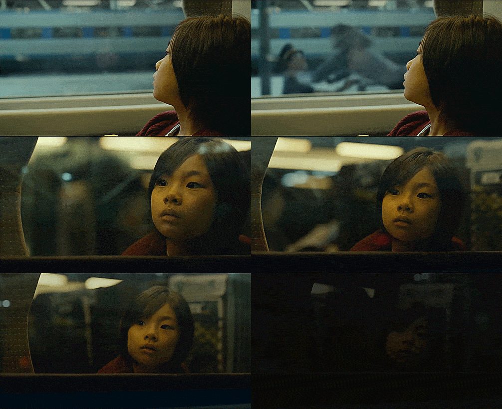
This South Korean zombie thriller from 2016 has garnered it's spot as the greatest zombie flick I've seen, surpassing 28 Days Later, World War Z and Shaun Of The Dead. What makes this such an amazing movie is not just because of the skilfully crafted action, but also due to it's lovable cast and the uniqueness of it's premise; A zombie attack that breaks out in South Korea, with the vast majority of the film taking place on a bullet train on it's way to the city of Busan. The quality that absolutely defines this movie for me is the excellently delivered social commentary, adding an extra layer to the emotional aspects. This is a zombie movie that will leave it's audience in tears. This is something no viewer, myself included, would ever think a zombie flick could do.


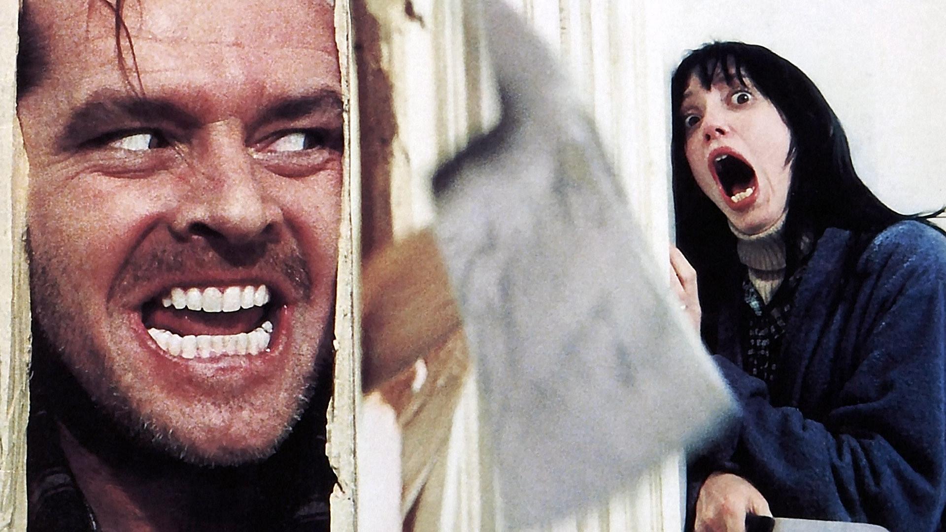
The Shining:
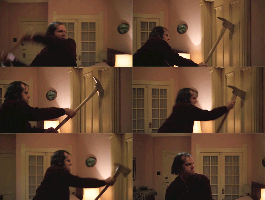
In 1980, Stanley Kubrick directed what is arguably one of the greatest horror films ever made, The Shining. Although the film is not considered revolutionary, it has certainly stood the test of time and immortalized Kubrick as one of the twentieth century’s most influential directors. Unlike today’s horror films, The Shining takes a bare bones approach, relying solely on ambience and suspense to achieve that long sought after thrill, which is a far cry from the puerile jump scares, gore and cliches which horror films nowadays rely on almost incessantly.


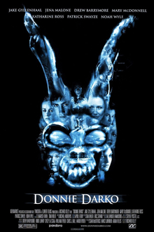
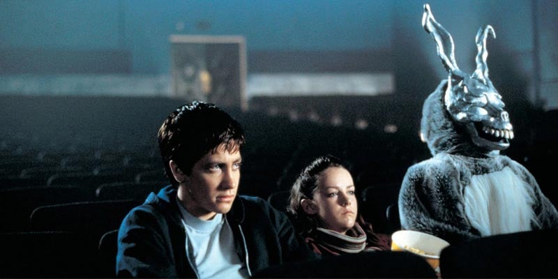
This 2001 sci-fi thriller was actually critically acclaimed as well, being considered a "cult classic" without "the best of all time" label on it. What the film does very well that's similar to The Shining, is the utilisation of suspense while including elements of sci-fi and fantasy. Richard Kelly takes a step away from the norm, rather giving the film a fast paced, action packed thrill ride, he opts for a slower psychological approach, which adds a certain kind of intensity which most directors fail to achieve.


American Sniper:
What makes American Sniper unique from other war thrillers is that it really captures the horrors and brutality of real war situations, rather than mindlessly blowing things up. The film deals with sensitive issues and thematic elements associated with war such as losing teammates, missing family and post traumatic stress disorder. All of these are touched upon in the film, adding that extra layer of detail and realism to the story. The realism combined with the excellent attention to detail of life in the midst of war makes this an overall fantastic film.
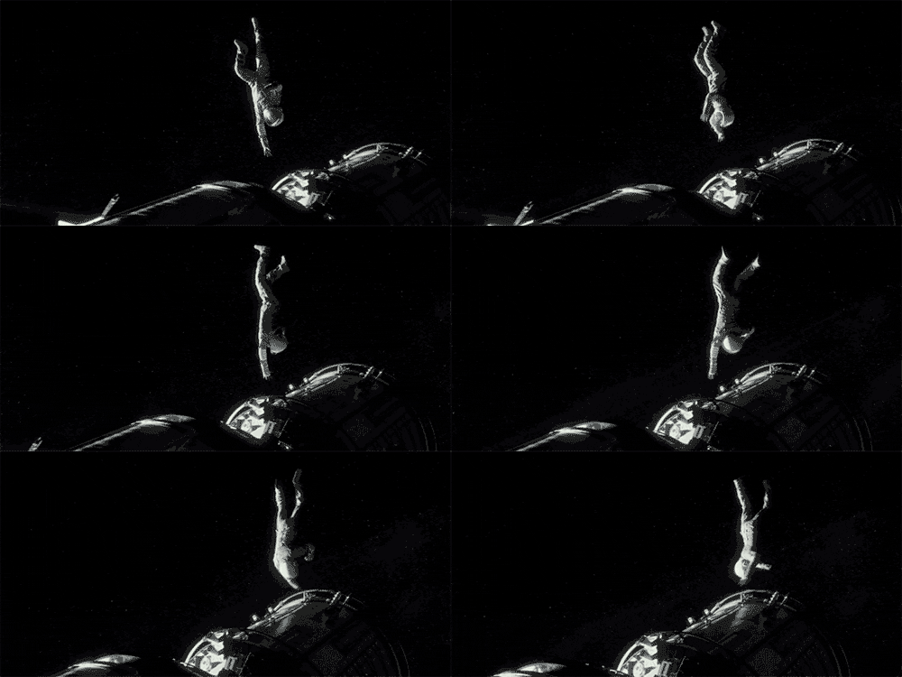
Gravity:
The 2013 film, Gravity is a visual masterpiece that contrasts greatly with the previously mentioned title, Interstellar. Gravity boasts remarkably beautiful and smartly implemented special effects, as opposed to Interstellar. More notably, however, the simplicity of both the plot and concepts of the film give it a certain clarity which afore mentioned lacked, resulting in a film that can be gripping without relying on overcomplicated and, at times, farcical themes which serve no purpose other than to create the illusion of depth.

Train To Busan:
This South Korean zombie thriller from 2016 has garnered it's spot as the greatest zombie flick I've seen, surpassing 28 Days Later, World War Z and Shaun Of The Dead. What makes this such an amazing movie is not just because of the skilfully crafted action, but also due to it's lovable cast and the uniqueness of it's premise; A zombie attack that breaks out in South Korea, with the vast majority of the film taking place on a bullet train on it's way to the city of Busan. The quality that absolutely defines this movie for me is the excellently delivered social commentary, adding an extra layer to the emotional aspects. This is a zombie movie that will leave it's audience in tears. This is something no viewer, myself included, would ever think a zombie flick could do.


Friday, 2 December 2016
The Opening Title Sequence
The opening title sequence of a film, television series or other types of media are pivotal tools in which the directors must include the starring actors/actresses, the studio behind the media, the director, the producers and of course, the title. The purpose of a title sequence (aside from being compulsory by law), is to suggest to the audience what they should expect coming into a new film. In this blog, I have decided to include and analyse the title sequences of three types of media, one film, one television show and one video game. This is useful in determining what type of opening sequence I will be creating.
At the start of the sequence bond is seen in a long shot surrounded by water clearly in peril. No titles are present at the start.
Here the camera has zoomed in so that the audience can clearly establish facial characteristics. Bond seems unconscious and in danger.
Here, there is now a closeup on Bond's hand. Similarly to the previous shots, he is still surrounded by water, however in this shot, there is no detail or devotion to the rest of Bond's body.
The next shot is centred around the first titles which come up, "Albert R. Broccoli's Eon Productions LTD." It is also a closeup on Bond being dragged down into the depths of the sea. The shot is mostly blacked out with hints of light behind Bond like an eclipse.
This shot is the first shot of which an actor's name appears (Daniel Craig), the font being a minimalistic, modern and subtle style. This long shot features Bond being dragged into deep waters by a hand. The view is mostly darkened but with light shining in from the top left corner.
This is a high angle shot, showing Bond sinking rather than being dragged down, as shown by the use of a high angle shot of his legs. The effect of the shot is to give the audience the idea that Bond is falling endlessly rather than sinking.
This is the shot showcasing the film's title. It is centrally placed as well as it is now bold, placing heavier emphasis on the main title. As for the shot itself, it is a long shot featuring Bond being pulled into some sort of sink hole. It seems as though Bond is falling just as the title says.
This shot is strange as it blends two types of shots together, a closeup and a long shot, both of Bond still floating through endless seas. Sinking objects can be seen in the distance as well as another actor's name who's font has returned to the minimalistic style used before.
The next shot is a long shot of Bond appearing as a target with a bullet hole/wound in it's shoulder, bleeding. Many of the same target Bonds float around. The effect of this shot is to demonstrate the danger Bond is in and the stakes that are on the line for him. Another actor's name appears.
The next shot is a closeup of a woman who is mostly blacked out. Most of the background is also blacked out. The reason for this is to establish a tone of ambiguity and mystery (Who is the woman? etc)
The camera pans downward, revealing that the woman is naked. Again, the background is mostly blacked out and another actor's name appears.
This next shot shows a gun (presumably Bond's) falling and hitting the bottom, a puff of sand coming out. Most of the shot is blueish black and still darkish.
The shot immediately after shows various daggers falling point first into the sand, along with the gun that has also fallen.
The daggers slowly turn into gravestones as the camera zooms in more. The background is still dark blue and black, still maintaining the dark, thriller, high stakes tone of the movie. Another name appears in the same font used previously. The name is placed in the centre to hint to the audience that that name plays an important character in the film's story (M)
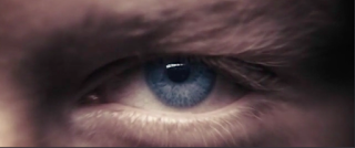
The next short is an extreme closeup of a character (presumably Bond) hiding behind some sort of wall. The camera zooms in further into his eye. The effect of this is to provide extra detail on the character's face/eye.
The next shots show Bond aiming his gun at his own shadows. He seems to be standing surrounded by various structures. The colours have have changed slightly in that there is more white.
The next shot is a zoom in some water with blood in it. As the camera zooms in, the audience will make out a skull made from the blood in the water. This symbolises the high stakes again just as some previous shots did. The combination of blood and a skull largely emphasises the stakes.
The next shot is a mid shot of a woman pointing a gun at the camera. The camera does zoom in until the camera is completely focused on the end of the gun. The colours have returned to it's dark tone.
The next shot changes the colour scheme of the sequence as it is now mostly black and orange as embers float around.
Next, numerous Chinese dragons begin to appear and fly around. The reason for this is to hint to the audience that perhaps the movie or parts of the movie, takes place in China. The colour scheme remains dark and orange in tone.
After the dragon shots, the next shot changes the colour scheme drastically as it is now black and white. Several shapes begin to appear, showing the shapes of different themes that an audience should expect in a 007 film (women, guns, etc).
The next shot is another skull, except it's black and white and the teeth are revealed to be gravestones as the camera zooms in. This imagery symbolises death over and over again (skulls, gravestones, colour scheme etc).
The next few shots revolve around Bond aiming his gun and surrounded by brick structures, similar to the one mentioned before. One of these shots shows a mid shot of Bond with a focus on the gun and the bullet wound in his chest.
This next shot zooms into Bond's chest wound, once again, there is more use of gravestones, again symbolising death. The colour scheme is bright red, shouting "death and suspense" into the audience's ear.
The final shot is of Bond behind a wall again. An extreme closeup showing the detail on Bond's face as the camera zooms into his eye.
This next shot shows a gun (presumably Bond's) falling and hitting the bottom, a puff of sand coming out. Most of the shot is blueish black and still darkish.
The shot immediately after shows various daggers falling point first into the sand, along with the gun that has also fallen.
The daggers slowly turn into gravestones as the camera zooms in more. The background is still dark blue and black, still maintaining the dark, thriller, high stakes tone of the movie. Another name appears in the same font used previously. The name is placed in the centre to hint to the audience that that name plays an important character in the film's story (M)
The next short is an extreme closeup of a character (presumably Bond) hiding behind some sort of wall. The camera zooms in further into his eye. The effect of this is to provide extra detail on the character's face/eye.
The next shots show Bond aiming his gun at his own shadows. He seems to be standing surrounded by various structures. The colours have have changed slightly in that there is more white.
The next shot is a zoom in some water with blood in it. As the camera zooms in, the audience will make out a skull made from the blood in the water. This symbolises the high stakes again just as some previous shots did. The combination of blood and a skull largely emphasises the stakes.
The next shot is a mid shot of a woman pointing a gun at the camera. The camera does zoom in until the camera is completely focused on the end of the gun. The colours have returned to it's dark tone.
The next shot changes the colour scheme of the sequence as it is now mostly black and orange as embers float around.
Next, numerous Chinese dragons begin to appear and fly around. The reason for this is to hint to the audience that perhaps the movie or parts of the movie, takes place in China. The colour scheme remains dark and orange in tone.
After the dragon shots, the next shot changes the colour scheme drastically as it is now black and white. Several shapes begin to appear, showing the shapes of different themes that an audience should expect in a 007 film (women, guns, etc).
The next shot is another skull, except it's black and white and the teeth are revealed to be gravestones as the camera zooms in. This imagery symbolises death over and over again (skulls, gravestones, colour scheme etc).
The next few shots revolve around Bond aiming his gun and surrounded by brick structures, similar to the one mentioned before. One of these shots shows a mid shot of Bond with a focus on the gun and the bullet wound in his chest.
The final shot is of Bond behind a wall again. An extreme closeup showing the detail on Bond's face as the camera zooms into his eye.
An interesting aspect of title sequences is that the title sequence in a work of media are all rather similar in that they all include the same conventions such as, starring actors, producers, studio names, music or various animations. The title sequences of other media such as television programs and even modern video games are beginning to adapt in way that is just like a movie. The examples below are title sequences from The Walking Dead (A popular TV show in the US) and Uncharted 4: A Thief's End (A critically acclaimed video game released in 2016)
One of the most important things a title sequence should do (as mentioned earlier) is that it is supposed to capture the genre and what the audience should expect from the media that they're about to experience. Viewers should see the title sequence and be able to identify bits of the plot, what kind of characters are involved and more.
One of the most important things a title sequence should do (as mentioned earlier) is that it is supposed to capture the genre and what the audience should expect from the media that they're about to experience. Viewers should see the title sequence and be able to identify bits of the plot, what kind of characters are involved and more.
The first shot of this sequence shows a dark room, a window with a wooden plank over it is present. The titles, "AMC presents" appears
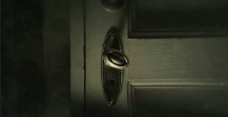
The next shot is a closeup of a turning doorknob. The colour scheme mostly consists of black and dark shades of green, yellow and black.
The first actor's name appears in this shot. It is clear to viewers that the main character, Rick is played by Andrew Lincoln, as shown in the newspaper with his picture on it. The colour scheme remains similar throughout the entire sequence.
The next shot is a long shot of a dark empty room. Not much is visible here other than a door.
This is an empty supermarket, a shot that follows the shot of the dark room. This is an unnatural view of an everyday location, giving it a feeling of abandon, a common theme in the zombie sub-genre.
In this shot, another actor's name appears alongside a mid shot of a character. This character is played by Jon Bernthal, as it clearly suggests as his name is displayed next to him.
The next shot shows a mostly black closeup of a shattered photograph of another character/actress, played by Sarah Wayne Callies, as it clearly states. Something which the audience may have noticed (assuming that they have not seen the program) is that these actors are behind broken glass, indicating that there is some degree of danger these characters will face. This also applies to Rick, who's picture has blood on it.
The next four shots are quick shots which are all themed around abandon. The first two are long shots of abandoned places, a house and a camper van. The last two are more abstract, both are absent of any titles or actors.
The next two shots are themed around the streets of the city the program is set in. One name appears in each shot. The first shot of the streets show that it is empty, perhaps evacuated, while the second has zoomed out slightly, giving the audience a bigger picture of the situation.
As another name appears, The camera focusses on a hospital.
The next shot gives the audience a detailed look at the hospital's interior, a dark, empty hallway with papers scattered around it. There is only one light on in the entire hallway. This is another unnatural, twisted spin on an everyday location (like the supermarket)
The next shot shows a school. Most notably, there is an American flag next to it. This hints to the audience (again assuming that they have not seen the program), that the show takes place in the States or otherwise is an American show.
The next two shots show more abandoned streets and views of the city. The names of the executive producers appear.
These next two shots are more shots themed around abandon. The quick shot of the crows symbolise death.
This is the final shot before the main title appears. The most notable thing about it is that it is a zoomed out view of an abandoned motor way in front of a city. This reveals to the audience a much bigger idea of what is going to happen in the show, where it takes place etc.
The main titles come up at the end. The words "Walking Dead" are emphasised with bigger and bolder letters as well as a dirty, grungy looking font.
For the Walking Dead, the first thoughts that come mind is thriller. It can also be identified as being a dark, intense show based on the use of muddy colours combined with the various shots used, abandoned streets, dark corridors and "creepy" imagery such as a teddy bear lying on the floor and a dirty newspaper (the main protagonist on the front). These are several hints to viewers that this is a television series about a zombie apocalypse (assuming they haven't seen or heard of the show)
The next opening credit sequence is from Uncharted 4: A Thief's End, a video game that has borrowed from movies in terms of making an opening sequence. This is actually one of my main sources of inspiration as I will have mentioned in my post about my film's plot and various ideas. In terms of inspiration, the general idea for my title sequence will have a similar style of that of Uncharted 4, where the camera focuses on various objects sprawled all over a surface. Objects include maps, compasses, drawings, photographs of actors and locations. There will also be moments where shots of exotic locations flash on the screen for several seconds each.
At first, the screen is completely black, no titles are present. The only audible sound is light music.
The first shot fades onto the screen, the title's read "Sony Compute Entertainment presents" Ink drawings of a coin and part of are map and compass are present in the shot. Judging by the colour, the objects present and the "paper", viewers will identify the genres action and adventure.
The camera pans to another part of this journal/page, revealing the titles "A Naughty Dog Game". More ink spreads around the page.
The main titles come up next, the font for "Uncharted" is bold and white while contrasting this, the subtitle, "A Thief's End" is in black cursive. The number 4 is hugely bold and is in red, emphasising the fact that this is the fourth instalment of the series.
The shot after the titles show the main protagonist (Nathan Drake) digging up what appears to be a box of some kind (It is actually a coffin). There is no view of his face. Players of the previous games will know that this exact thing happened at the prologue of the first Uncharted game. New players will presume that this would've been in an older game as the title clearly states that it is the fourth game in the series, as this title sequence is essentially a recap of the events played out in Uncharted 1, 2 and 3.
After the coffin shot, a crashing plane is present as several executive producer's names come up. There is clear danger involved in Drake's adventures.
The next shot shows an old submarine. The added blue colours could signify water, though it is unclear whether or not it is a waterfall or anything else.
The next shot shows a mid shot of the two main characters in the game series (Elena on the left and Drake on the right). Drake once again has his back turned to the camera, while there is more detail on Elena's face. Both characters are participating in a dangerous shootout.
The next shot is a shot summarising the previous images. The words, "El Dorado" appear at the bottom (Drake's first discovery) This shows the viewer/player that up to this point, the images shown were events and things associated with Drake's first adventure (The first Uncharted game). The actual shot consists of Drake leaping to a rope carrying a golden statue (the one on the right).
The next shot shows a long shot of another character standing next to a pile of treasure. His facial features are unclear as most of the shot (just like the others) is in the style of a drawing.
The next shot consists of another compass at the top, some kind of statue on the bottom and an enemy character on the right. He is heavily armoured and carries a minigun, giving the viewer an idea of the types of enemies Drake has been facing in the past and possibly in the future too.
The next three shots centre around a new adventure. The use of dark and light blues suggest that the terrain is snowy. There is also a train which appears normal on the top shot, but then seems to have derailed on the third shot. The second shot shots Drake leaping towards some ledge, once again, his face does not show.
Next, there is a long shot of sort of village. Based on the familiar coloured banners, this village is located in Nepal or Tibet.
The next shot shows a strange looking tree labelled "tree of life" next to another drawing of a large gateway labelled "Shambhala". This shows that since the "El Dorado" shot, the drawings shown represent the events of Drake's second adventure.
The next two shots are closely linked to each other, both use shades of yellow and brown, indicating a desert terrain. The first shot shows a cargo plane with vehicles hanging out of it, Drake can be seen hanging onto it. The second shot shows the plane has crashed in the middle of the desert. A structure can be seen to the left, labelled Ubar, Drake's third discovery.
Drake's face is finally revealed in this mid shot of him and Elena (his companion) smiling at one another. Clearly their stories have ended happily
The next shot shows characters riding horses in the desert. There is a ring buried in the sand. Based on how closeup the ring is, that means that it holds a significance.
The final shot shows Drake and Elena walking off into the distance carrying bags. The screen fades into black as the game's directors name's appear in the black area.
Subscribe to:
Posts (Atom)


